
Brand Identity · Self-initiated · 2024
Checkmates
"Learn the moves they won't see coming."
The brief
A community for people who think differently.
Chess pulled me in. The deeper I got into it, the more I noticed there was no brand that felt like it was made for people who actually love the game — not just play it. Most chess branding skews traditional, academic, or generic. I wanted to build something that felt like a community — a place to connect, play, and learn from each other.
The name came naturally. Checkmates — the people you play with, the move you're working toward, and the culture you're part of all at once. The tagline followed: "Learn the moves they won't see coming." That's chess, but it's also life.
The creative insight
In chess notation, + means check. M means mate. Every serious player knows this — it's the language of the game. The logo doesn't explain itself. It speaks directly to the people who already understand.
The thinking
A logo that rewards the initiated.
The shorthand mark is +M — directly lifted from chess computer analysis notation. In competitive play, + denotes a check (the king is under immediate threat) and M signals forced checkmate. Every serious player recognizes it fluently. Most casual observers see a clean abstract mark.
That gap is the point. A brand for enthusiasts doesn't need to explain itself to everyone — it needs to mean everything to the right people. The mark becomes a signal to the community: you know what this means.
The same philosophy carries into the wordmark. Chess piece silhouettes — a rook in the C, a king rising from the M — are embedded throughout the letterforms. They're subtle enough to miss on first glance, unmistakable once you see them.
The shorthand mark
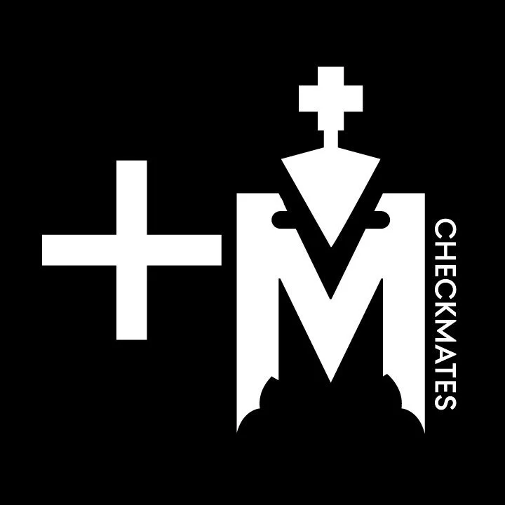
White on black — primary usage
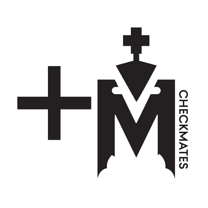
Black — secondary usage
Mark logic
The + (cross) is the chess symbol for check. The M is the symbol for mate in computer analysis. Together they read as +M — checkmate in notation — while functioning as a clean, geometric mark that works at any scale from app icon to billboard. The king piece crown rises from the apex of the M, visible only once you're looking for it.
The wordmark
Primary wordmark — white on black
Embedded silhouettes
The letterforms aren't custom type — they're precision-modified to hide chess pieces within the negative space. A + sign is hidden within the C of check — the chess symbol for check, right there in the opening letter. A rook silhouette is embedded in the H. The M of mates is constructed from the king piece itself — the triangular body, the cross atop the crown, the castle-like base. Three pieces hidden across the word. The letters are the pieces. The pieces are the letters.
Black on white — light background usage
The full system
Three marks, one language.
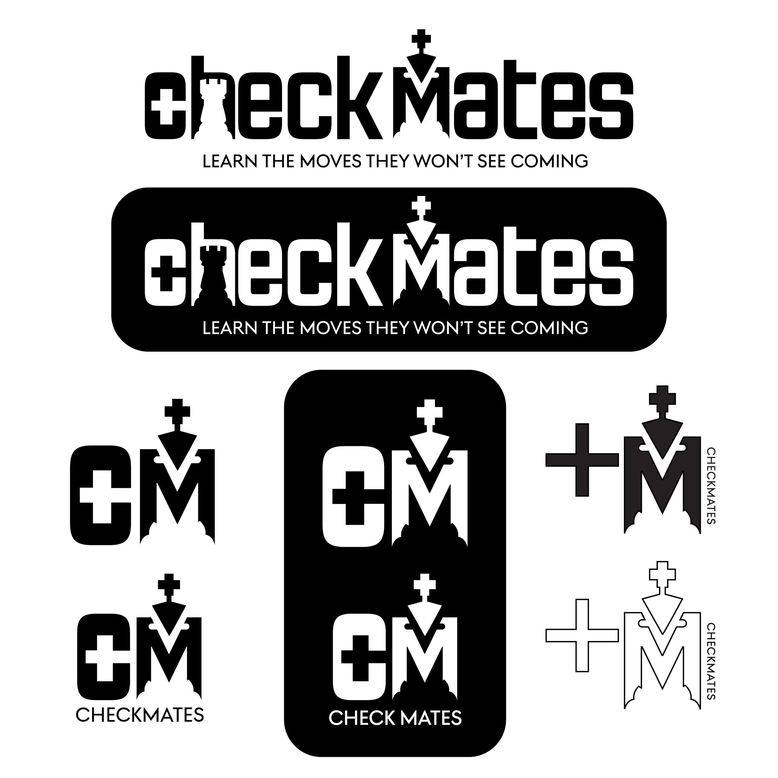
Wordmark
Full "checkmates" with embedded piece silhouettes. Primary brand application — apparel, signage, digital headers.
+M shorthand
The notation mark. App icon, avatar, merchandise. Communicates instantly to the chess community.
CM badge
C containing the check +, M containing the king. Compact lockup for stamps, patches, small-scale use.
Design decisions
Built for longevity.
The mark is built in pure black and white. No gradients, no effects, no color dependencies. A brand built for community needs to live everywhere — merchandise, digital, print, embroidery — without degrading.
| Color | Black / White — no additional palette |
| Typography | Modified custom letterforms — not a typeface |
| Concept | Chess notation (+M) embedded in brand mark |
| Scale | Fully functional from 16px favicon to large format |
| Audience | Chess enthusiasts, competitive players, community members |
| Naming | Checkmates — the community, the move, the people |