
Brand Identity · Motion · Self-initiated
Trash
'N' Dash
Expedited trash removal. Same day, 3 hours or less.
The brief
A startup that moves faster than the problem.
Trash removal isn't glamorous — but the pain point is real and universal. Trash 'N' Dash was conceived as an expedited junk and trash removal service promising same-day pickup in 3 hours or less. The brand needed to communicate two things immediately: speed and reliability.
The idea came from a brainstorm session — one of those write-it-down moments where the name and the brand potential clicked together fast. The initial sketch revealed a mark with more depth than expected, and the system built from there.
The creative insight
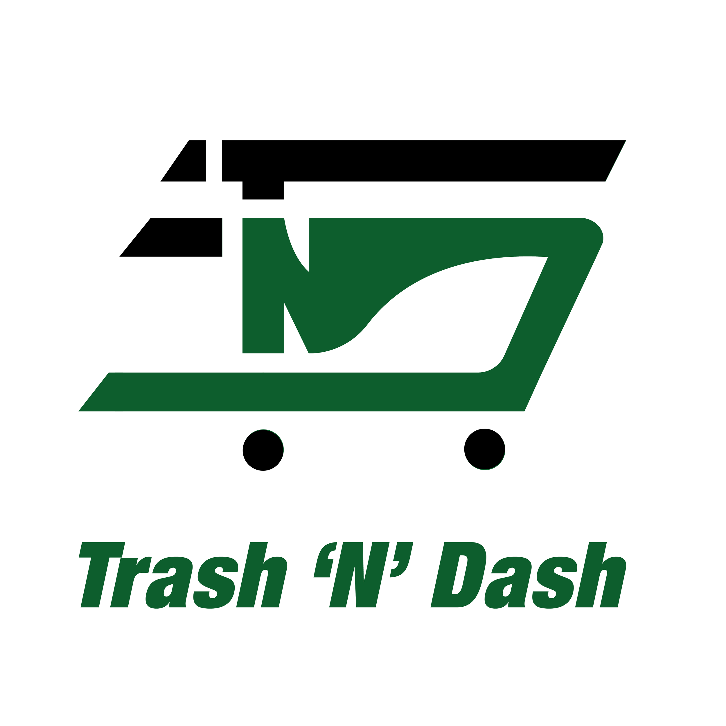
The mark hides TND inside a trash can with speed lines. One icon communicates the entire business: what it removes, how fast, and who it is.
The thinking
Three layers, one shape.
The logo is a simplified trash can with speed lines integrated into the form — the universal read for "fast." But within that shape, the letters T, N, and D are embedded as hidden geometry, tying the mark directly to the brand name without spelling it out.
The result is a mark that works on every level: a casual viewer sees a trash can with energy. An observant viewer spots TND. The brand community recognizes the full system. Each layer rewards attention without requiring it.
The name itself does part of the work. "Trash 'N' Dash" is immediately memorable, slightly irreverent, and tells you exactly what the service does. The brand job was to back that energy up with something that felt legitimate enough to trust with your home or business.
The mark
Primary green colorway — main brand application
Icon logic
The trash can silhouette is simplified to its most recognizable form: rectangular body, hinged lid, two wheels. The speed lines integrate into the geometry rather than sitting on top of it — they're part of the shape, not decoration added after.
Hidden TND
T, N, and D are embedded within the mark's geometry. The letters are structural — they form the lines of the can itself. Remove them and the mark loses its integrity. They're not hidden for the sake of cleverness; they're load-bearing.
Speed communication
The motion lines on the can reference racing and sports branding — categories that have solved the visual language of speed. Borrowed equity: the mark borrows credibility from categories people already associate with fast.
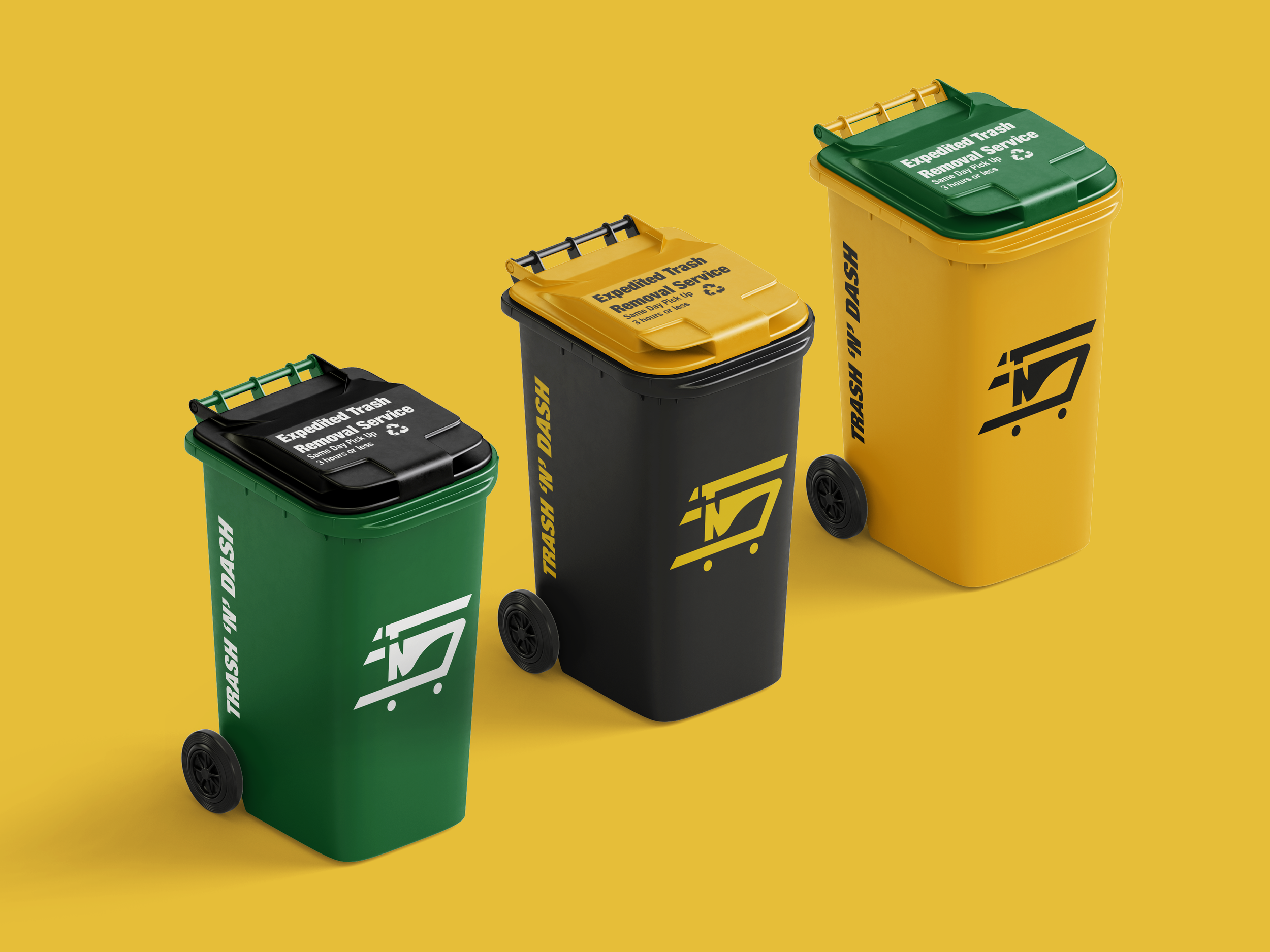
Colorway system
Three palettes. One brand.
Green / Black / Yellow — three service colorways
Colorway rationale
Three colorways give the brand flexibility across fleet vehicles, uniforms, and service tiers without fragmenting the identity. Green reads as eco-conscious — the primary brand color. Black reads as premium — for business or high-priority service. Yellow reads as high-visibility, high-energy — the loudest statement of speed. Each works independently; all three together establish a system with range.
Pattern & brand world
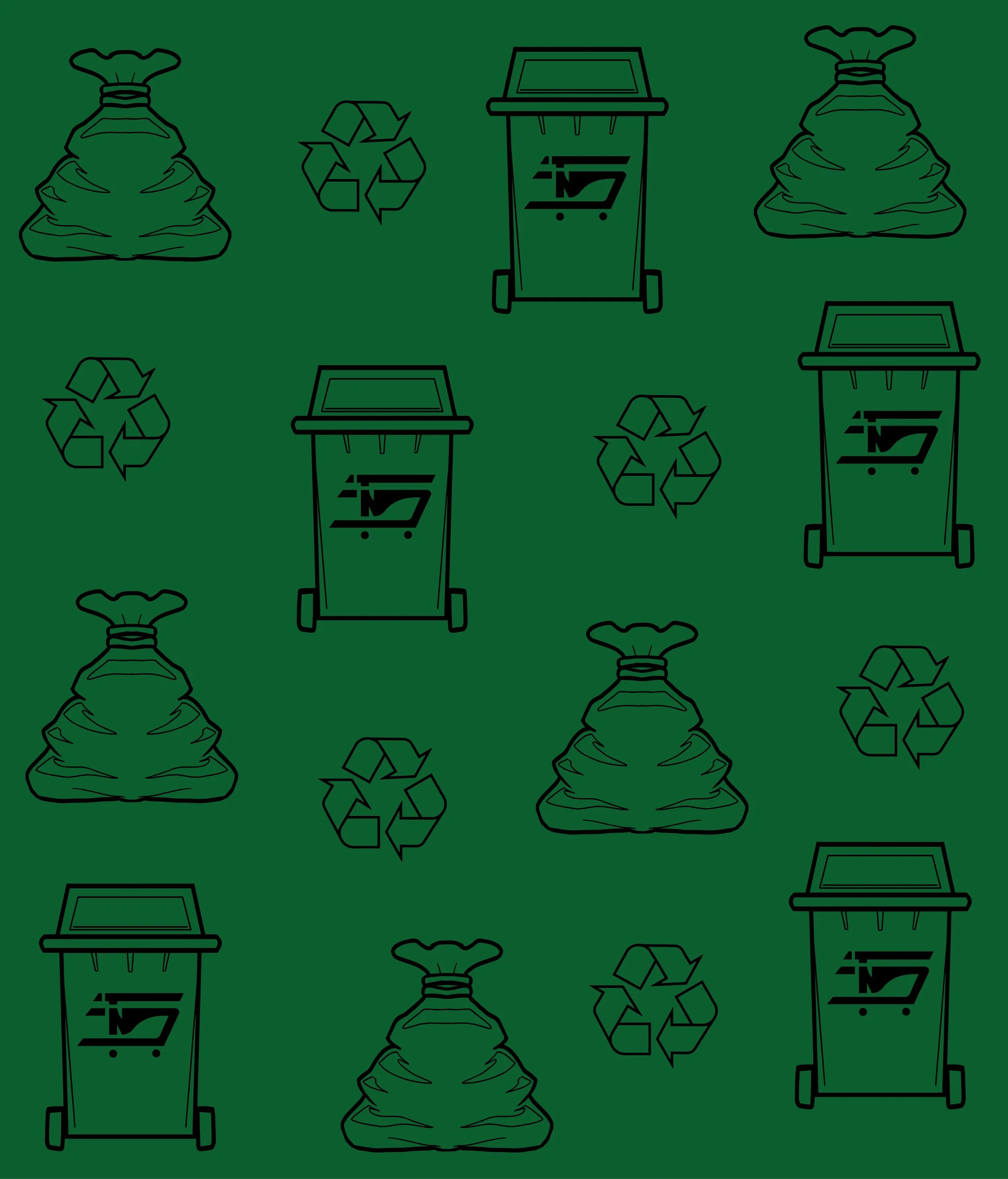
Illustration pattern — hand-drawn icon system for brand texture
Pattern system
The illustrated pattern extends the brand beyond the logo — trash bags, recycling symbols, and branded cans repeat across a grid. The hand-drawn quality softens the industrial subject matter, making the brand feel approachable rather than utilitarian.
Brand video
A short motion piece was produced showing the brand in motion — the logo animating in, the can mark in use across contexts. Motion work is part of the full brand deliverable for a service business where ads drive conversions.
Design decisions
Built to scale fast.
| Primary color | Brand green #2E7D32 · Yellow #F5B800 · Black |
| Concept | Trash can + speed lines + hidden TND letterforms |
| Colorways | 3 — Green (eco), Black (premium), Yellow (high-vis) |
| Deliverables | Logo, pattern, can mockups, brand video |
| Service promise | Same day pickup · 3 hours or less |
| Brand tone | Energetic, reliable, slightly irreverent |