
Brand Identity · App Design · Self-initiated
Melanin
Meets
"Find that 90's R&B love."
The brief
A dating app with a specific frequency.
The dating app space is crowded with generic interfaces and broad positioning. Melanin Meets was conceived for a specific audience with a specific cultural identity — Black singles looking for something that feels like the warmth and depth of 90's R&B. Not algorithm-first. Connection-first.
That specificity is the product. The tagline "Find That 90's R&B Love" isn't nostalgia marketing — it's a cultural shorthand that the right person hears and immediately understands. The brand speaks to people who feel it before they can explain it.
The creative insight
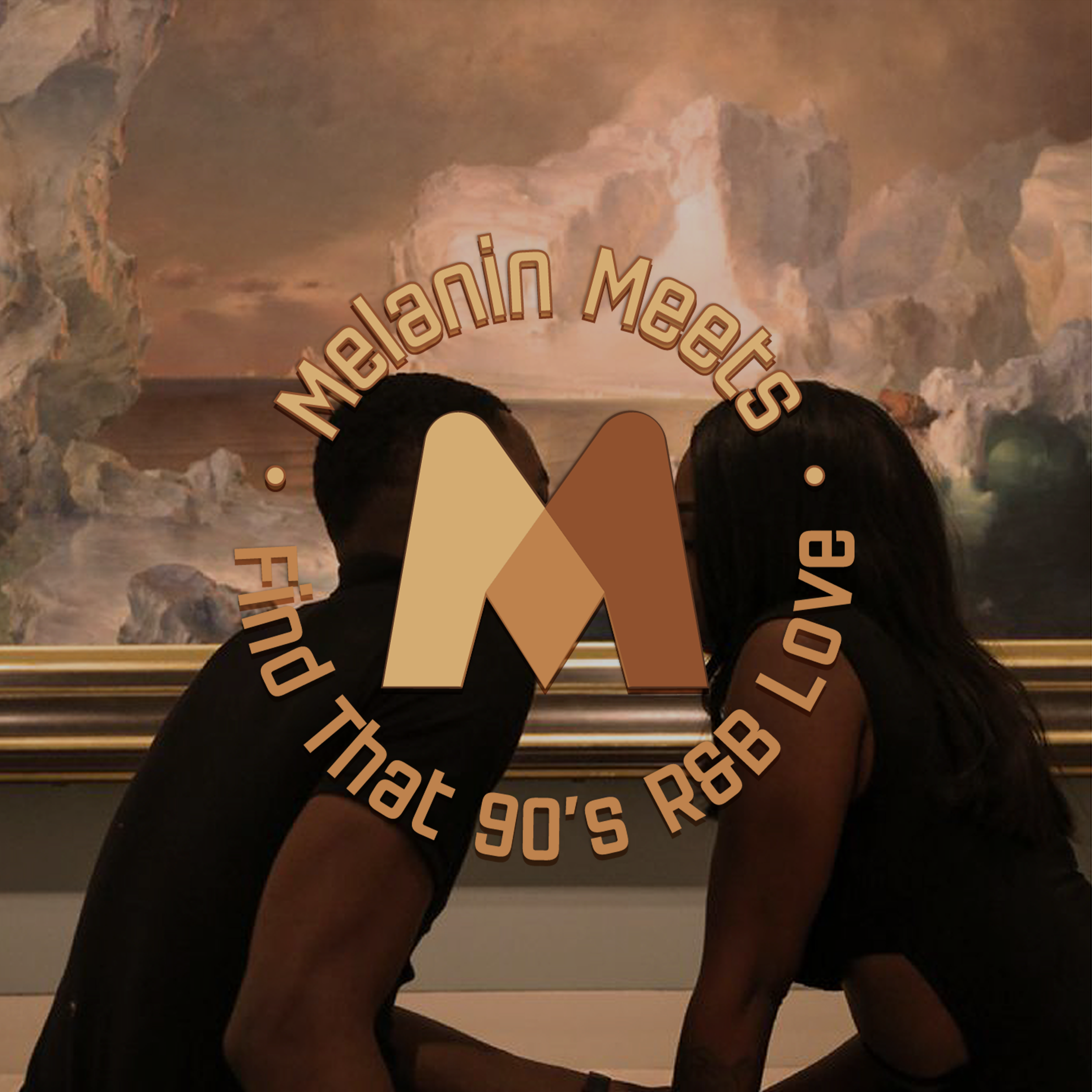
The logo isn't one M — it's two people meeting. Different skin tones converging at a single point. The second M is hidden where they touch.
The thinking
The palette is the concept.
The M letterform is built from two distinct forms in different shades of melanated skin tones — light to dark brown — converging to create the lettermark. Where they meet at the bottom center, a second M is formed in the negative space. Two marks in one: the brand name, and the act of meeting itself.
The color palette wasn't chosen for aesthetic preference — it's the entire brand concept. Every shade represents a different melanin tone. The logo is literally a spectrum of Blackness coming together.
A key constraint shaped the mark: app logos live in small circles and squares — profile pictures, app icons, notification badges. That means highly stylized or abstract letterforms fall apart at 40px. The M had to be immediately readable at any size, which pushed toward the clean geometric execution rather than something more expressive.
The mark

Primary M
The main M is constructed from two overlapping forms in different melanin tones. The left stroke is warm beige-tan (#DEB88A), the right is deep brown (#8B4513 range), with a mid-tone at the convergence point. The 3D layered effect creates depth without complexity.
The hidden M
Where the two strokes meet at the bottom center, a second M is formed in the negative space. One logo — two readings. The primary M is the brand. The hidden M is the moment of meeting.
App icon consideration
The mark was built to function at 40px — the size of a profile picture or notification badge. No fine detail that won't survive compression. The bold geometry reads instantly at any scale.
Brand world
The moodboard sets the frequency.
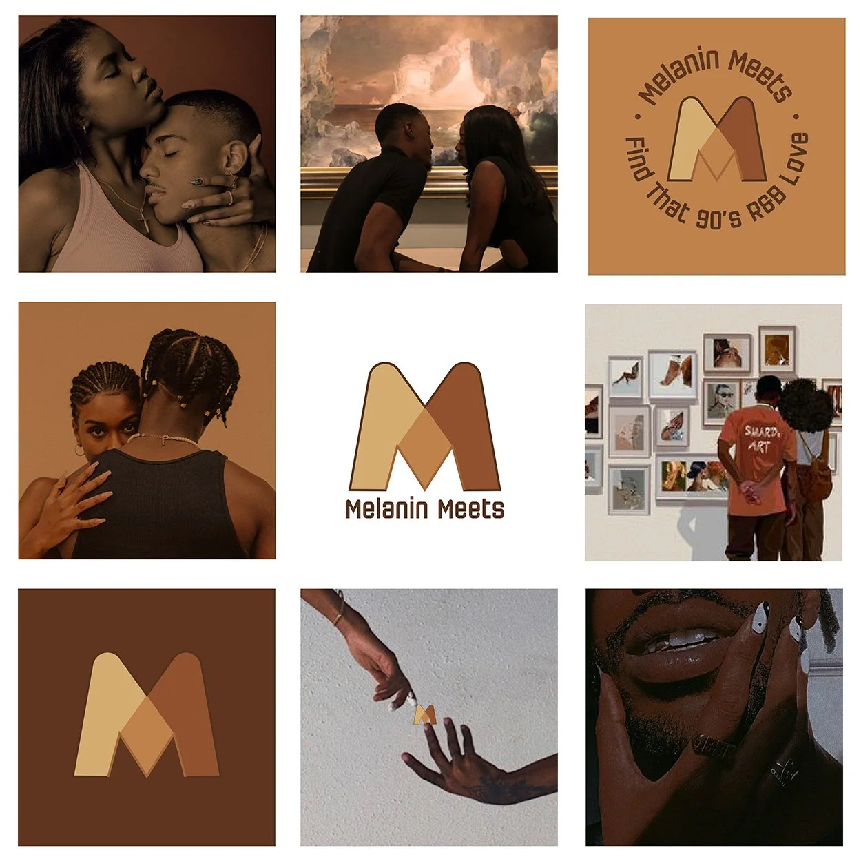
Brand moodboard — lifestyle imagery, logo variations, tagline lockup. "Find That 90's R&B Love."
Moodboard intent
The imagery selection was deliberate — couples in cultural spaces (museums, galleries), candid moments of joy, intimacy without performance. The 90's R&B reference isn't about the era — it's about a feeling: warmth, authenticity, depth. The moodboard establishes that the app isn't about fast matching. It's about real connection.
Pattern system

Brand pattern — logo mark repeated in heart-form grid
Pattern logic
The M mark tiles within a heart-shaped arrangement — the logo becomes a motif when repeated. Alternating orientations (standard and rotated) create visual rhythm. For packaging, digital backgrounds, and in-app textures.
Phone mockup
↳ Add phone mockup here when available
Design decisions
Built for the right people.
| Color palette | Melanin skin tone spectrum — tan to deep brown |
| Background | Deep chocolate #3D1A08 |
| Concept | Two skin tones converging = two people meeting |
| Hidden element | Secondary M in negative space at convergence point |
| Scale constraint | Designed to hold at 40px app icon size |
| Tagline | "Find That 90's R&B Love" |